Как донести историю...
Comment: The performance of retro elements in packaging design
The retro design of the packaging embodies people's nostalgia, and is a remembrance of things, people, or past times. Not only do people who have personal experience have nostalgia, even people who have not experienced it will be deeply touched by an atmosphere, fashion, or other things in common with human nature. For older people, retro design is a kind of spiritual comfort. For young people, retro packaging is a kind of curiosity about the past, a way to communicate with elders, and a way to solve the generation gap. For people with special experiences, retro design seeks a resonance. It's not just a kind of like or a simple memory, but a kind of sublimation, the cultivation and washing of the individual's character. If there is no remembrance of the beauty of the past, how can we pursue the beauty of the future?

1. The background of retro packaging design
The current society is in a period of rapid development. Old things are being replaced or broken, and new orders, rules, and systems have been established or are being improved. People’s psychology is in a state of confusion, or even panic, and lack of security. , Reliance, trust, and warmth. At the same time, in today's highly developed commodity economy, direct communication and contact between people have become more and more alienated due to the high degree of electronic communication in modern communication, and individuals are more and more alienated emotionally. On the other hand, people need more care and consideration. In this case, people will produce a kind of nostalgia to varying degrees: either to find the shadow of the past, or to reminisce about the good times in the past, or to rely on memories to rely on emotions. Such psychological needs make retro packaging design more and more a fashion in today's society.
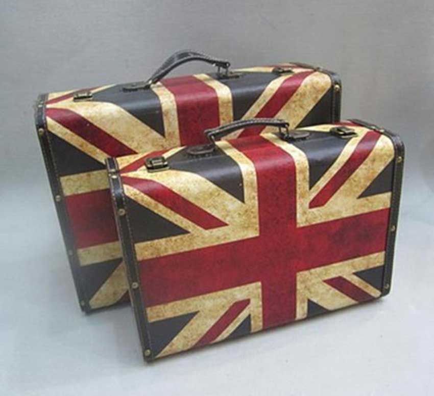
When a way of expression needs to correspond to an ideology recognized by people, it is called a good way of expression. Retro packaging design is an emotional need, a psychological reflection with a solid historical foundation. As a designer, he should convey this emotional theme through his design works, and transfer the consumer's sight and emotion to what he wants to express. The box comes up. Popularity is always in reincarnation. In this era, many brand designers are working on retro design, copying classic products from the past, and letting the sales boom of decades ago resurrect among modern young people.
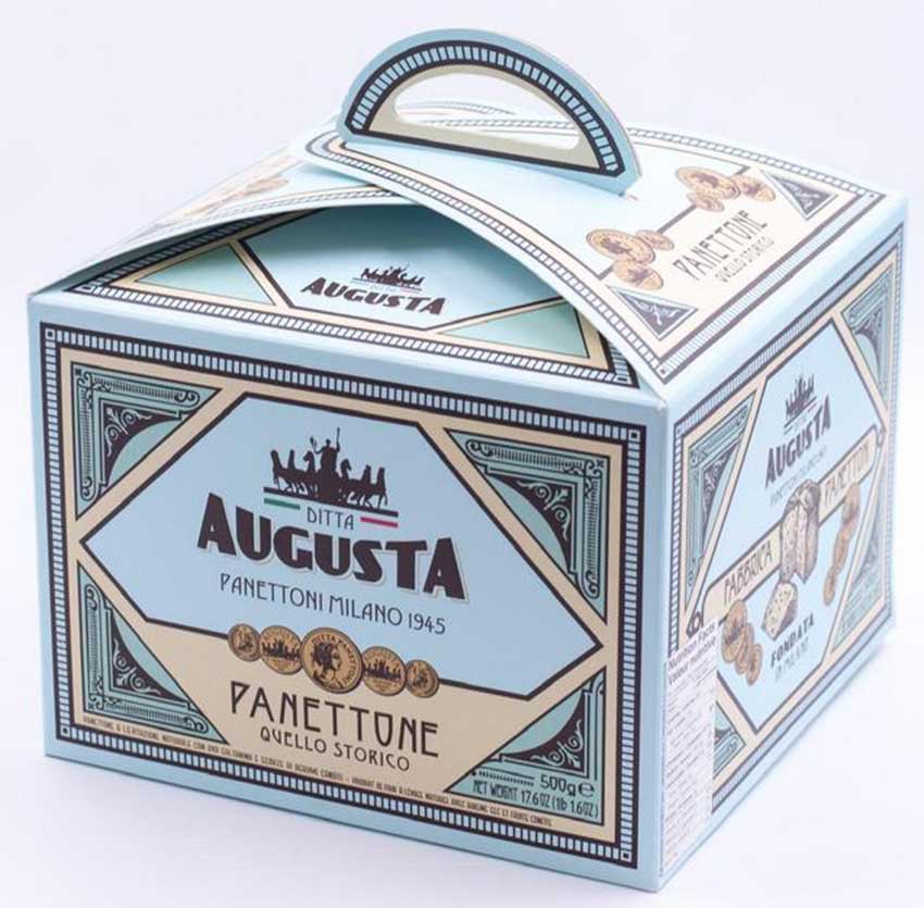
2. Extensive application of retro elements
"Old" labels are plastered everywhere in the city: old record players and old records from the 1950s are displayed in the corner of the high-end restaurant: old photos from the 60s hang on the wall of the cafe: an old-fashioned blackboard in front of the farmhouse restaurant The order card of the newspaper: More and more old stories and secrets from the last century are displayed on the shelves of the bookstore: the long-lost "old brown sugar" and "old wine" are seen in the supermarket: many retro candies are packed in the counter of the mall Shining light...
Retro packaging has become a plot, a sentiment, and a taste. Nostalgia, as a social phenomenon, hides huge business opportunities behind it. The clever use of nostalgia in this period will have an effective and positive effect on the segmentation of consumer groups. Many designers have captured this point and incorporated nostalgic elements into the packaging design to combine with the product and give the product a personality and emotion, thereby triggering resonance. We can see more and more nostalgic, rustic, hand-painted and other forms appearing. These designs give people more "kindness" visually. It reminds people of the innocence and happiness of childhood, and reminds people of the long-lost nature. This product packaging design has greatly shortened the psychological distance between consumer audiences and producers, and has become a new trend in modern packaging design marketing strategies.

3. The performance of retro elements in packaging design
1) Use some special regional characteristics to express nostalgic retro packaging
Each place has its own clear cultural connotation: the magnificent ancient Rome, the romantic Paris of France, the magic capital of Shanghai, China...These may become the attachment carrier of the product, which can be used to enhance the image and personality of the product packaging.
The Chinese wine brand-"Shanghai Old Wine" uses the image of Shikumen as the basic graphics on its packaging, and uses the single-line Shikumen as a memory point to fully express the essence of Shanghai Old Wine's integration of Chinese and Western cultures. Shikumen is a typical building in Shanghai. It used to stand upright in the 1920s and 1930s. It condenses the essence of Shanghai culture and represents the connotation of Chinese and Western culture. "Shikumen", as a microcosm of the past life of Shanghainese, carries the past history of Shanghai. Shikumen is unique because it only belongs to Shanghai. Shikumen is a characteristic of Shanghai. It is a nostalgic plot, an eastern and western charm, and a disappearing memory. In the bottle design, the flat oval bottle shape is more suitable for the interpretation of the image of Shikumen. The decent but unassuming bottle sticker occupies a larger visual contact surface on the shelf and has an extremely strong recognition power. 1939 and 2001 are two concepts coined by "Shikumen" brand Shanghai old wine, that is, different vintages are used to distinguish old wines brewed from different wine bases. 1939 uses black labels, noble and elegant, suitable for the tastes of mature consumers: 2001 uses red labels, red is warm, passionate and fashionable, and is more suitable for the elegant taste of young consumers and first-timers. The interaction of the red and black labels allows consumers to make choices easily and naturally, and unknowingly, half of the sales are successfully completed for the merchants.
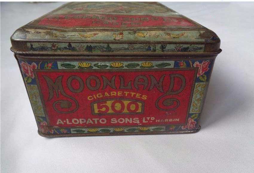
2) Express retro packaging with special characters from a certain age
Movie stars, singers, politicians, etc. are often the nostalgia of people representing an era. These characters can take us to that exciting past years, recall the past youth, and thus be moved and remember the product.
3) Use old classics to express retro packaging
Although people's lives are richer than before, and many products are constantly being updated, there are still many classic products that we miss. These products are branded with traces of past life and constitute a monument in the personal resume. Many people now clearly remember the fun brought by these old brands and are very happy to share these experiences with their children.

Summary: Retro packaging design has performance in almost all areas: food, health products, cosmetics, home appliances..., but only accurate retro creativity can properly reflect the characteristics of the product. For companies and brands with a certain amount of historical accumulation, retro packaging can highlight product quality and historical heaviness. The retro elements are well grasped, can reproduce the classics of the past, and can also form the trend of a new era.
.jpg)


.jpg)
.jpg)







Latest comments