2021 latest tin box packaging design trends
As the new year begins, this article lists the top ten new tin box packaging design trends in 2021TOP. At first glance, these ten trends look very different from each other, such as having simple geometric figures, as well as super detailed ink drawings and substantial characters and patterns, but this is actually a cohesive topic, and also From packaging design to the key link of artistic packaging.
In 2020, we have all witnessed the importance of e-commerce in our daily lives. By 2021, this will not change anytime soon. With too many e-commerce channels, you may lack the experience of visiting stores and experiencing the well-planned brand atmosphere. Even the immersive design of online shopping websites cannot make up for this. Therefore, tin box packaging designers and tin box manufacturers and business owners are increasing their investment in order to be able to deliver brand messages to your doorstep. Its real purpose is not to replace the in-store experience, but to meet the ever-changing and evolving consumer demand for packaging now and in the future. All this will create a new and immersive experience through the unique tin box packaging trend in 2021.
01. Reveal the contents of the package through the tin box PVC window
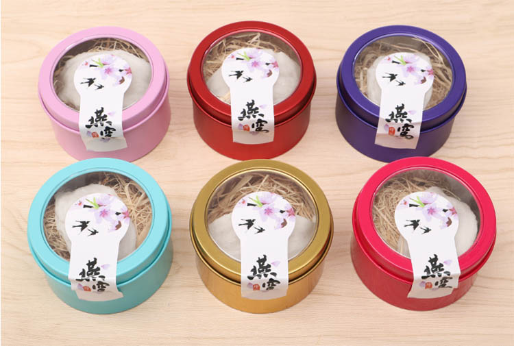
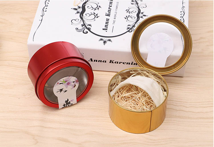
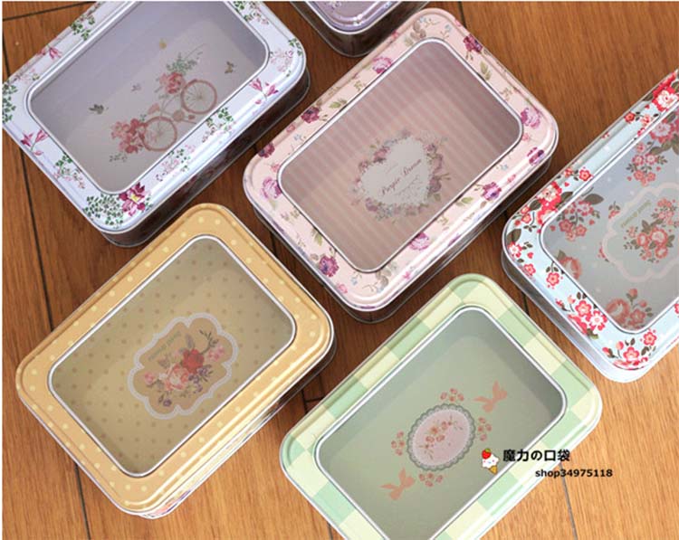
The tin box PVC window is not just a decoration, it can even reveal the full meaning of the product. In 2021, I hope to see the real situation of the product on the tin box packaging, and hope that it can complete a specific task, that is, to display the contents of the package. The structure of these tin boxes is usually simplified. Compared with the literal meaning of the product itself, you can get a more intuitive understanding of the packaged items from the PVC window of the tin box.
02. The real old-fashioned unboxing experience tin box
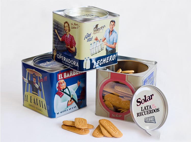
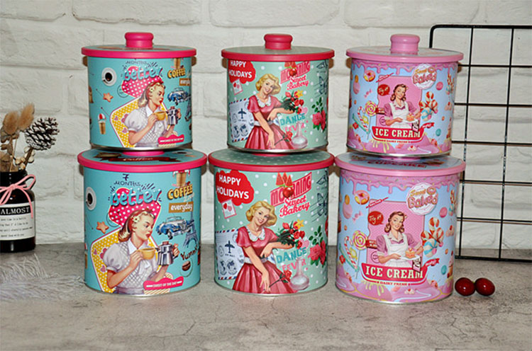
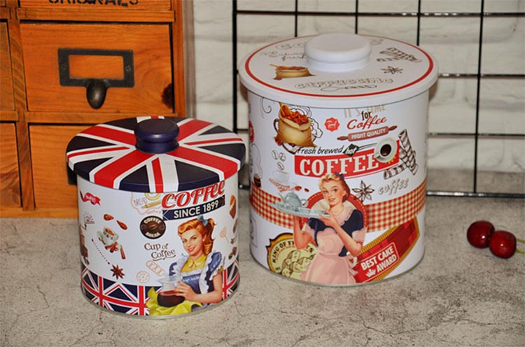
Retro-style tin box packaging has become a trend, so what is different this year? For items packaged in retro style, the whole unboxing experience looks so real that you might even think that you have experienced a period of nostalgia. In 2021, you will not see a bunch of tin box packaging that usually has a retro style. You will see that the packaging has a real old-fashioned appearance and will make brand penetration more in place by creating a complete immersive experience.
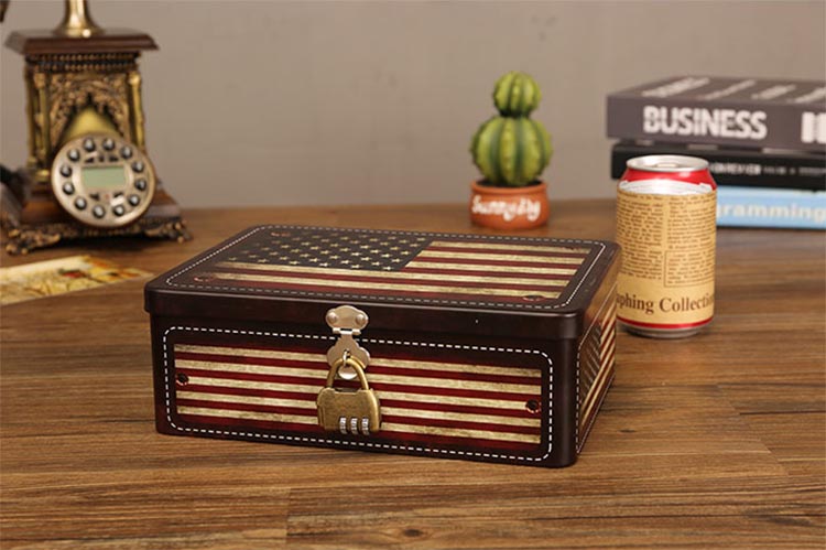
For example, you will find that the tin box packaging design looks almost indistinguishable from what your great-grandmother used, which brings you to a different moment. This means going beyond logos and labels, and covering the entire brand experience, and using retro-style textures, bottle shapes, materials, packaging, and image selection. Now, the tin box packaging itself feels like it was pulled out of a shelf frozen in time.
03. Super simple geometric figures
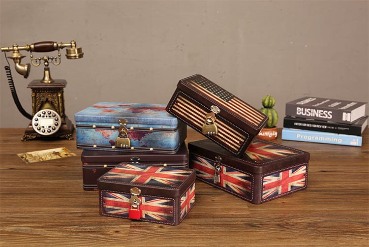
Another packaging trend we will see in 2021 is the design of extremely simple but bold geometric concepts. We will see bold geometric shapes, neat lines, sharp angles and expressive colors, which give the tin box packaging design more advantages. Just like the pattern trend, this trend allows consumers to see the meaning of the product. However, unlike the patterns and illustrations that describe the contents of the package, these designs are abstract. It may seem simple at first glance, but this is a very influential way for the brand to speak out and leave a lasting impression.
04. Exquisite tin box packaging with lock
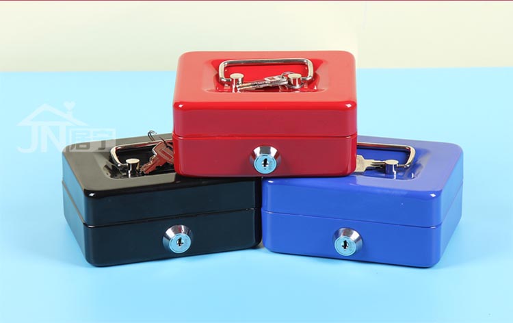
In 2021, people expect to see many tin box packaging designs, hoping that the tin box packaging itself is a work of art. This trend is mainly developed in high-end products, but it can also be seen gradually in mid-end products. Designers draw inspiration from paintings and paint textures, or incorporate their interesting combination locks into tin box designs, or make them the focal point. The goal here is the boundary between privacy and fine art.
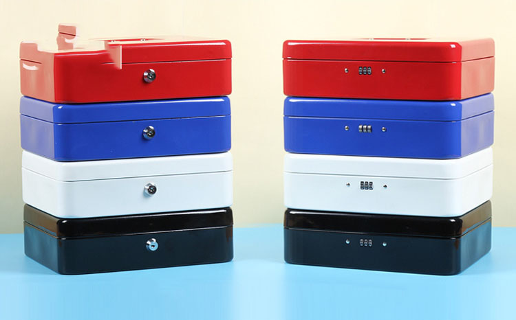
Although some designers like to draw inspiration from old metal boxes, such as cheesecake boxes, this trend mainly comes from abstract painting and fluid painting techniques. Texture is the key, and tin box packaging designers are imitating the various textures and effects you see in oil or resin paintings.
05. Pot-shaped tin box packaging design
Overall, the upcoming tin box packaging trend in 2021 feels more like an “art gallery” than “commercial graphic design”. In addition to eye-catching geometric shapes and tactile textures, you will also see more products. The packaging of these tin boxes looks like they were drawn from anatomical illustrations or engineering blueprints.
Maybe it's because the 2020 epidemic forced us to slow down and reassess what is really worth doing, or it's a response to how minimalism has dominated packaging design for many years. In any case, be prepared to see more designs with incredible details. The tin box looks and feels like it was hand drawn and inked for an ancient, sometimes surreal scientific publication.
06. Lunch tin box with organic shape color blocks
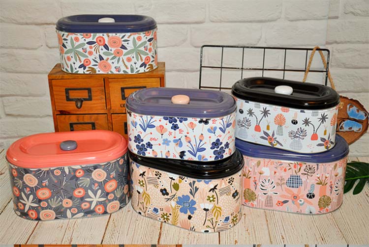
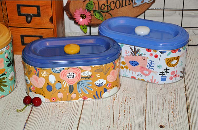
What separates the 2021 organic color block from the previous color block trend is the texture, the unique color combination, and the number of changes in the shape and weight of the color block. These are not clear and straight-edged color boxes, and cannot form a perfect grid and clean lines. They are uneven, unbalanced, a bit like mottled collages. The pattern is overlaid on the color, the designer makes full use of the unexpected color palette, and injects shapes such as spirals and waves into the lunch tin box packaging design.
07. Round tea tin box design
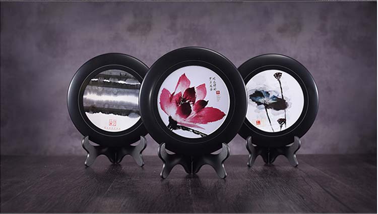
Some designers did not draw or mark the focal point of the tin box packaging, but chose to make the name of the tea the star of their design. These designs are extremely creative in the letters and can make the product name take center stage. Each name on these packaging designs is like a work of art in itself, giving the entire tin box design a unique personality.
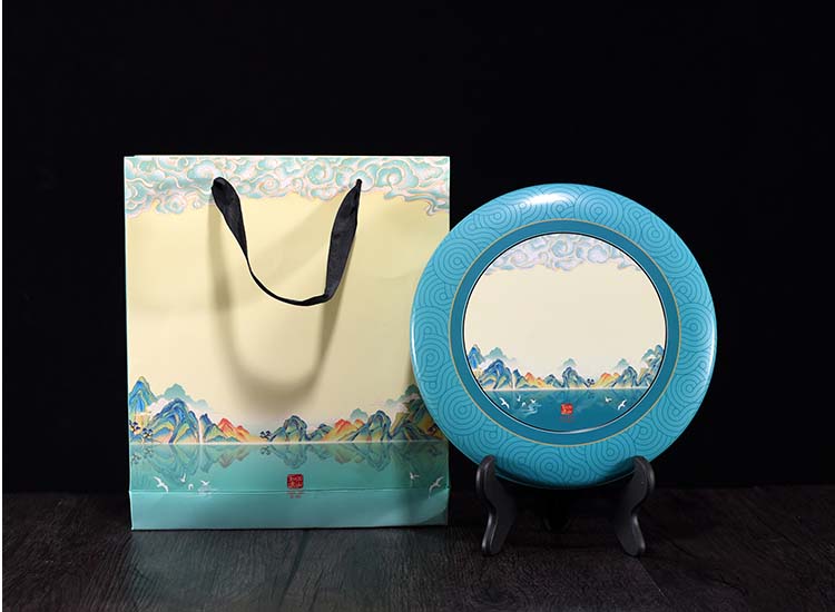
There is no doubt that this kind of tin box packaging is called a product or what type of product it is. This is undoubtedly the perfect tin box packaging trend for product-centric companies that want to increase brand awareness. These designs rely on powerful layouts that can reflect the overall beauty of the brand. Any other design element can make it shine.
08. Perfect picture symmetrical candle tin box
It is not uncommon to see conflicts between major trends. In fact, this happens almost every year, and the tin box packaging trend in 2021 is no exception. Some packaging designers use organic imperfect shapes in their designs, while others take the exact opposite approach, creating perfectly symmetrical tin box packaging.
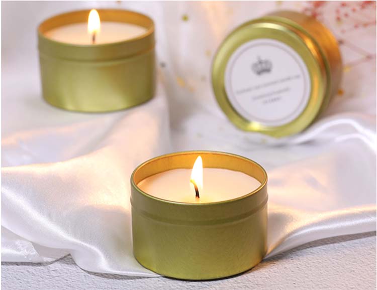
Not all designs that fit this trend are compact and complex designs. Some products, such as those originally designed by Raluca De for Yerba Mate, are looser, disjointed, and have negative space to reduce the sense of closure. However, they are as completely symmetrical as more complex designs, creating a visually satisfying sense of perfection, which is the characteristic of this trend.
09. Story-driven packaging, supplemented by weird characters
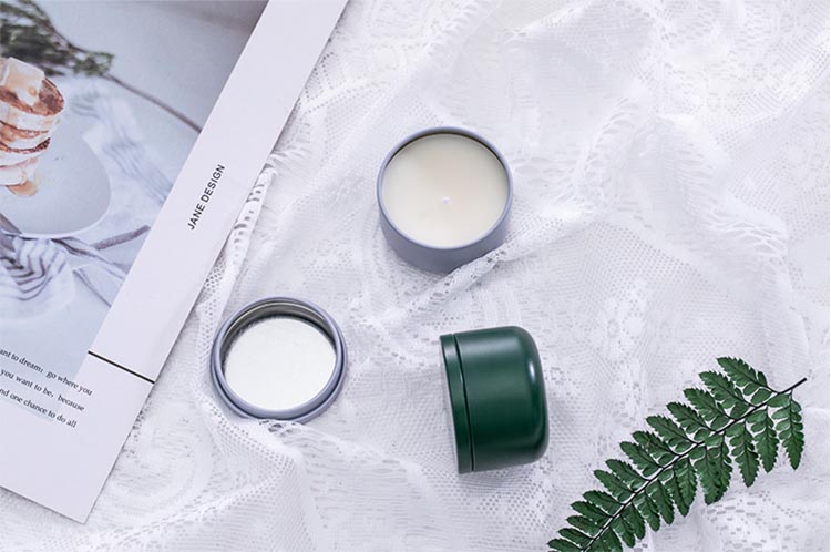
Storytelling is a key part of any effective branding. In 2021, you will see many brands extend storytelling to tin box packaging. 2021 will bring us characters beyond the mascot. It seems that every character will have its own full story. And, not only can you see static mascots, but you can also see these characters in the scene, as if you were reading a graphic novel. Therefore, you don’t have to go to the brand website to read the story, or to infer the brand story through its advertisements, but to pass the protagonist to your door and tell a story directly from the purchase of tin box packaging.
These characters are usually cartoonish and fun ways to bring their brand story to life, making you feel as if you are reading a comic book, looking at the tin box packaging design. An example is the design work of San Permeni, which provides us with a panoramic view of the huge peach attacking the city.
10. Pure color tin box packaging
In addition to bold packaging that reads like a comic book, you will also see products packaged in solid tin boxes. Although it uses a much more limited palette, this tin box packaging trend is no less characteristic than any other trend in the top ten trends. In 2021, people expect to see that packaging design can make print color choices arouse people's attention.
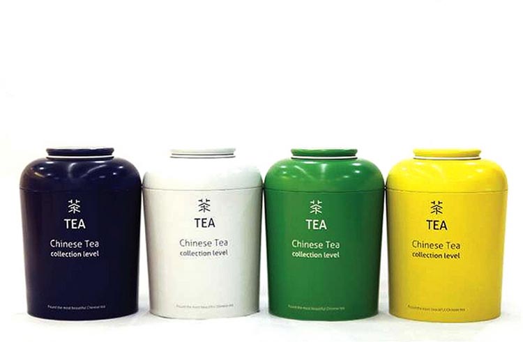
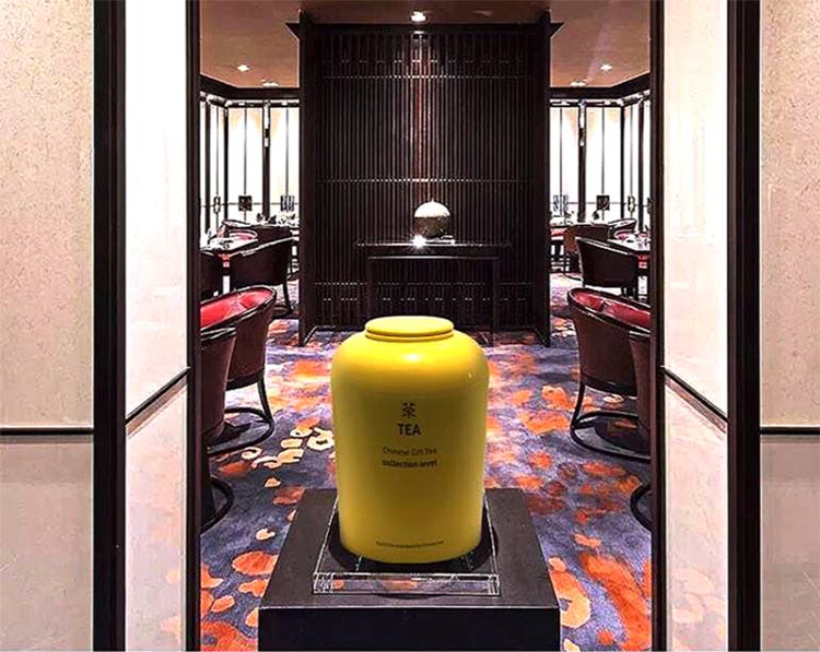
One thing you will notice about these packaging designs is that, in most cases, they use bright and bold colors. This is what makes this trend so fresh. This is not the sterile all-yellow tin box that comes with the Macbook, these designs use absolutely bold colors. And in some cases, such as the work designed by Eva Sheila for Balbo, they chose an unusual shade to create an atmosphere and directly guide the buyer's attention. By doing this, they lay the foundation for future sales by telling the buyer about the product instead of showing the product immediately.


Top auteurs