As a professional...
Categorías de blogs
Buscar en blog
Últimas entradas del blog
-

-
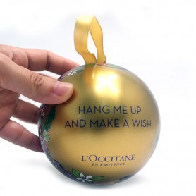
 Custom Color Printed Tin Boxes – Eye-Catching Packaging for BrandsRead more
Custom color printed...
-

-

-

Entradas de blog populares


Entradas de blog destacadas
-
-
Custom Color Printed Tin Boxes – Eye-Catching Packaging for BrandsCustom color printed...Read more
-
-
-
Etiquetas de blog
lata de galletas personalizada al por mayor
mayoristas de caja de lata de la navidad
proveedor de cajas de lata para regalos navideños
venta al por major cajas de hojalata
caja de hojalata con cierre de seguridad para niños.
caja de lata con forma de calabaza personalizada al por mayor
proveedor de embalaje de caja de hojalata
caja de lata de té personalizada
fabricante de cajas de almacenamiento de metal.
venta al por mayor mini caja de lata impresa personalizada
fabricante de cajas de hojalata personalizadas
latas de velas de emergencia
lata de galletas navideñas personalizada personalizada
fabricante de envases de caja de hojalata
proveedores de caja de lata de caramelo de menta
contenedor de hojalata a prueba de niños
caja de hojalata vacía personalizada
cajas de lata de dulces vacías al por mayor.
caja metálica de hojalata con tapa.
caja de regalo de navidad
Galería de fotos
-

Sample gallery
-

Customer Service


Últimos comentarios