As a leading Custom...
How to make cookie tin boxes more visually attractive
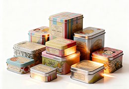
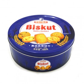
The visual design of the appearance of the cookie tin box is a means and result of the subjective form of the eye function. Vision is an important sensory system of humans. It is easy to be attracted by bright or colorful objects, especially in the field of packaging boxes. The form of expression and visual effects are our key concerns. The visual impact of the color difference of the cookie tin box is one of the ways to enhance visual communication. The color elements can stimulate people’s senses and make the audience produce the cookie tin box. Deep memory and novel experience.
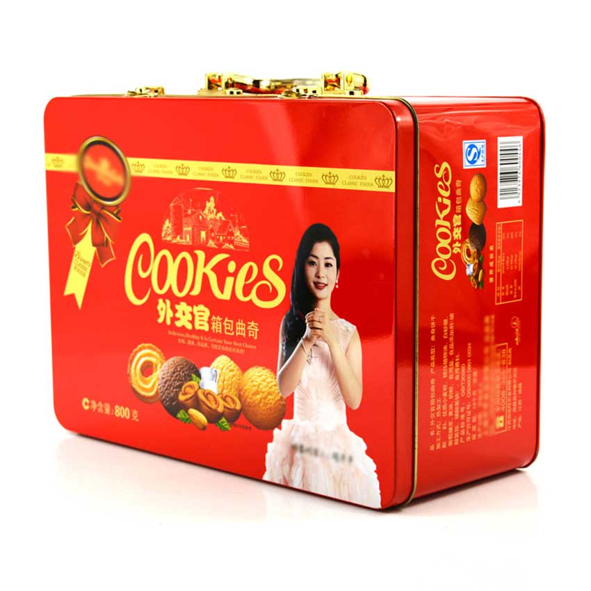
The tin box packaging design of cookies, which is characterized by visual impact, is differentiated, interactive, and reproducible.
①Color difference. Color difference is the main feature of visual impact in information transmission. The uniqueness and novelty of visual language are closely related to the effectiveness of information transmission. Generally speaking, the greater the difference in the regional information conveyed by the decorative color of the cookie tin box, the more cultural content it contains.
② Regional and cultural interaction. The visually impactful cookie tin box emphasizes two-way communication and information feedback in the transmission of cultural information, presenting a distinct regional and cultural interaction.
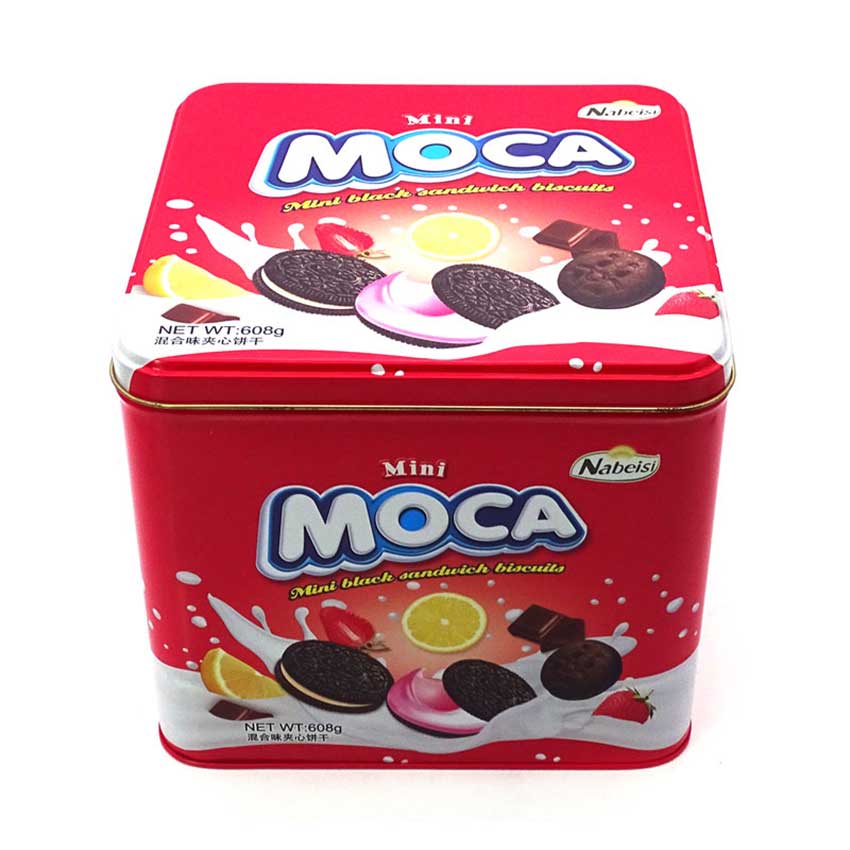
The visual impact of the cookie tin box design is not simply the color visual impression and visual effect, but it reveals the three-dimensional judgment and acceptance of the aesthetic process of the cookie tin box design, reflecting the design purpose and conveying cultural information.
The graphic design of the cookie tin box is based on the visual image presented by the expressing object in a certain form, and is the conscious expression of the design concept and design psychological activities. When designers use graphic expression elements as tools to express the visual impact of graphics, they can usually use the following two methods.
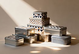
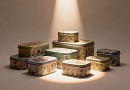
① Citation of traditional images. The traditional image of cookie tin box packaging design is the most effective and direct way to improve the visual impact of packaging. Because of the structure of the human eye and the way of thinking, people are most concerned about having traditional patterns. Designers can use this feature to combine various digital processing techniques and graphics to make cookie tin boxes more visually impactful.
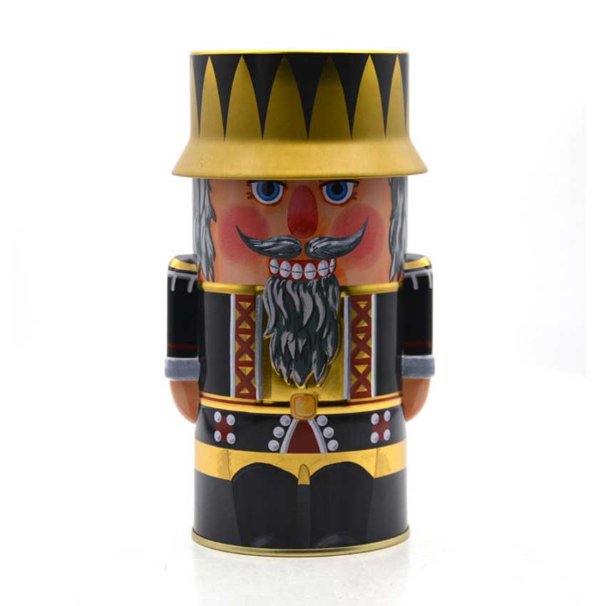
② Irregular design of cookie tin box. People themselves are psychologically adaptable to things that conform to the conventions, but they are psychologically curious about things that are asymmetry and irregular, so that people can pay more attention. In the packaging design of the cookie tin box, the irregularity of the box shape can convey more different information, making the audience think of change and vitality.
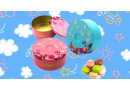
Color gives human emotion characteristics and cultivates human aesthetic culture. For cookie tin box packaging design, the use of bright colors can not only attract the audience, but also produce a strong visual impact, truly reflecting the regional culture. When designing a cookie tin box with visual impact, the following two color factors should be considered:
(1) Choose a specific color according to the nature of the content to be expressed. There is an inevitable connection between color selection and expression. Designers need to be clear about the nature of the object to be expressed, and then look for the most appropriate color for creative design. Products of different nature need to be matched with different colors.
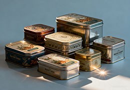
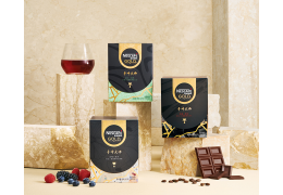
For example, for chocolate boxes and coffee cans, foods with red/black tones are food-like and delicious, and advertisements for related foods are suitable for choosing warm colors. If the color is selected correctly, it can effectively guide the eyes of the participants.
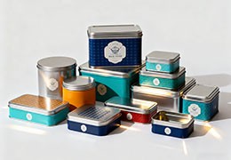
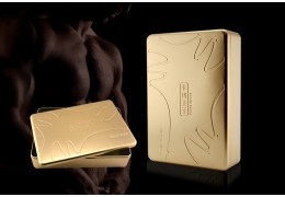
②The overall decoration color of the cookie tin box echoes the local color. The color that occupies most of the packaging determines the tone and atmosphere of the entire packaging and can reflect the character of the packaging box and the image of the product. The designer must be careful when choosing the main color. An advertisement image can only have one main color. Too many dominant colors will produce dazzling visual effects.
However, when arranging the main colors, pay attention to the use of the partial colors of the cookie tin box. The partial colors are consistent with the main colors, which can produce a deep and stable feeling. You can also use the contrast colors of the main colors to improve the vitality of the picture. Strengthen the artistic appeal of the picture.
Text originated from people's imitation of things in nature. At first, it was a relatively simple graphic symbol with a certain degree of reality and descriptiveness. The rich text database and excellent calligraphy art provided unlimited creativity for the cookie tin box. Space, text shaping with visual impact needs to consider the following two aspects:
The first is the text layout of the cookie tin box. The content form, primary and secondary relationship, virtual and solid relationship, density, etc. of the cookie tin box text should be considered; in the process of packaging text layout, the design must strictly follow the law of visual flow. Considering the physical level, the visual psychological level and the law of individual visual flow in hierarchical levels, an ideal guiding direction is established for the reception of audience information.
②The decoration and beautification process of the cookie tin box text itself. The main purpose of the design is to attract consumers’ visual attention. Therefore, when designing advertisement texts for cookie tin boxes, according to the needs of text content and visual performance effects, the text itself is decoratively beautified, such as artistic processing, flexible text organization, etc. Improve the appeal and visual impact of text. Arrangement is the orderly arrangement of various visual elements. It is a personalized language full of life and vitality. Different sequences of arrangement will produce different visual effects of the picture.
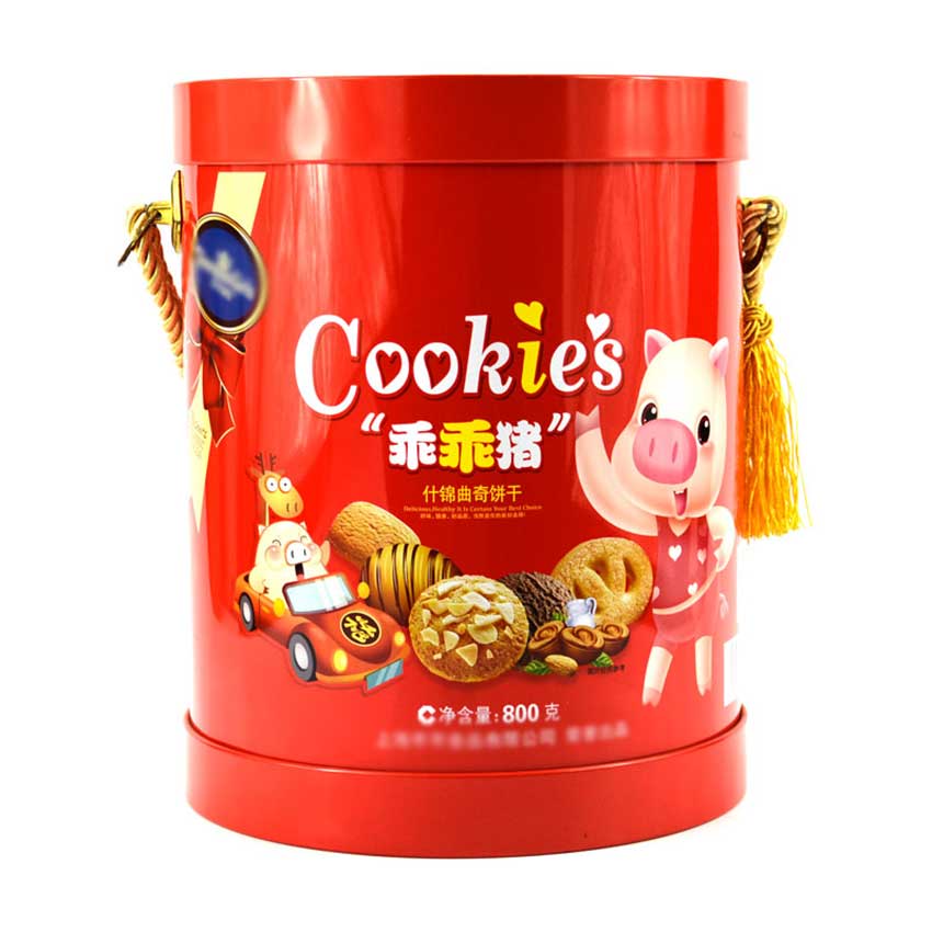
Color is the most important in the design that best reflects the sensitive and passionate characteristics of people and is closely related to people's lives. Due to the development of modern chromatology, people's understanding of color is deepening and their understanding of color functions is getting deeper and deeper, which makes color play an important role in the design of cookie tin box. Experienced cookie packaging box designers pay great attention to the role of color, and the role of color on human physics, psychology and physiology. They use people's visual perception of color to promote the sale of cookies.




Latest comments